
Overview
-
The CAN Sites tab under the Captive Portal screen provides a comprehensive visualization of analytics related to Captive Access Network (CAN) sites. This guide explains the features and functionalities available on the Sites page of the dashboard.
-
The Sites tab enables the user to view the data consumed by the sites. Users can view the amount of data consumed between any particular time interval and view further breakdown of the data usage.
-20250720-202641.png?cb=6b1963f4f356bf78c00efba933a81599)
Headers
The headers provide a quick summary of overall network activity:
-
Sites Online - Number of currently online sites.
-
Total Sites - Total number of registered sites.
-
-
Subscribers - Number of subscribers currently logged in.
-
Typical Subscribers - Historical average number of subscribers.
-
New Subscribers - Number of new subscribers.
-
-
Sessions - Number of active login sessions.
-
Typical Sessions - Average session count based on past data.
-
Failed Sessions - Failed session attempts.
-
-
Total Usage - Total data consumed (e.g., 586.288 GB).
-
Typical Usage - Historical average data consumption (e.g., 104071.164 GB).
-
Usage 24 Hours Ago - Total data used 24 hours prior (e.g., 14790.042 GB).
-
Usage
The Usage bar chart shows the amount of data consumed by the different sites under the selected organization. Hovering the cursor on any item on the bar chart highlights the site and shows the amount of data consumed by that site in GB.
a. Site-wise Data Usage (Bar Chart)
-
Displays the top sites with highest data consumption.
-
Helps identify heavy usage zones.
b. Usage Over Time (Line Graph)
-
This section shows a line chart that displays the amount of data consumed by all the selected sites at different time instances. The horizontal axis contains the time instances, and the vertical axis contains the amount of data in GB. The graph between these two axes gives the user a clear understanding of how the data has been consumed over the given time period.
-
Hovering the cursor on any item on the chart highlights that time instance and shows the amount data consumed by the sites in GB.
-
Shows total data usage trend across all selected sites over the selected time range.
-
Assists in identifying peak usage hours.
-
Click Bar chart

-
Click Line chart

-
Click the

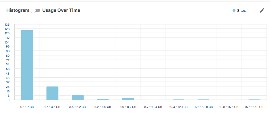
-
Hovering the cursor on any item on the chart highlights the entry and shows the number of sites and the name of sites in that data usage range.
Site CAN Report Table
This table gives a detailed view of individual sites. The Table shows the following information:
-
Site – Name of the Site.
-
Organization Name – Name of the organization managing the site
-
Internet Status – Shows if internet connectivity is online or offline
-
Alerts – Active alert count per site
-
Subscribers - Number of subscribers currently using the site
-
Sessions - Active session count
-
Avg Plan Count - Average number of plans used at the site
-
Usage (GB) - Total data used by the site
-
Search - Use the search bar to find specific sites
-
Pagination - Click the dropdown given below the Site CAN Report heading to change the number of sites displayed in one page. The pagination helps the user navigate to the next page by using the < > buttons or click the dropdown menu to move to the intended page.
Click Download to download the table data in CSV format.
-20250720-205503.png?cb=25444ad24d9c60bfc35fea28f4668b80)
-
Filter Button: Apply filters to customize data displayed
-
Usage values reflect data consumption based on the selected type: Plan or Overage.
-
Plan Usage: Data used against quota allocated via subscriber plans and top-ups.
-
Overage Usage: Data consumed beyond the plan quota and top-ups.
-
-