
Starlink - Analytics
The Analytics screen enables the user to view the key metrics of the different Starlink User terminals associated with each site. These User terminals have different key metrics to measure their performance.
Click Analytics tab from the Starlink screen to open the Analytics section.
Select the Period from the dropdown menu. The available options are Last 1 Hour, Last 6 Hours, Last 12 Hours, Last 1 Day, Last 7 Days and Last 30 Days.
The user can also select a custom date and time interval using the From and To fields.
The screen shows a line chart depicting the data consumption of the different Service Lines for each day of the selected time interval.
Click the Starlinks field to open the dropdown menu. In this dropdown, all the Starlink User terminals available in the sites will be listed.
Select the required User terminals.
In the Metrics field, select the required metrics from the dropdown menu. The Key Metrics available are as follows:
Downlink Throughput
Uplink Throughput
Ping Drop Rate
Ping Latency
Obstruction Time
Signal Quality
The performance of the User terminal based on the selected metrics is shown in the format of a line chart. The horizontal axis contains the time instances, and the vertical axis contains the metric values in their corresponding SI unit.
The graph between these two axes gives the user a clear understanding of how the User terminal has performed during the selected time interval.
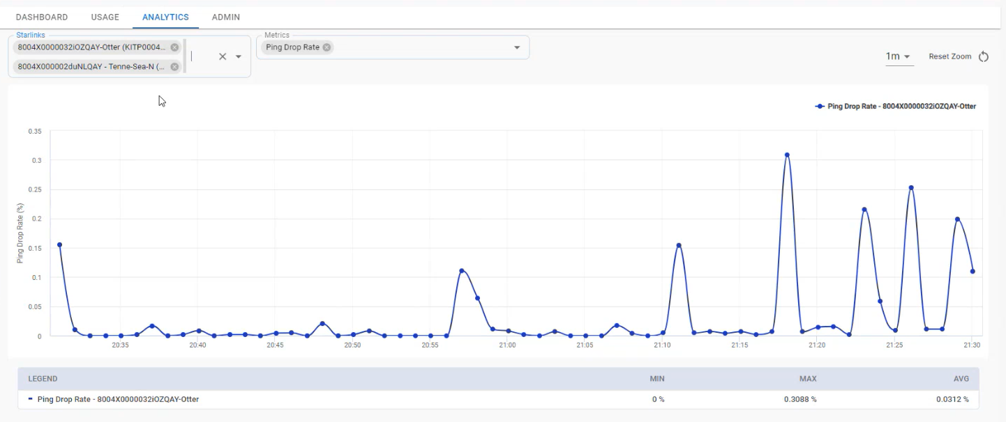
Analytics Chart
The user can select multiple User terminals at the same time and compare their performances.
The user can also select multiple Metrics at the same time and view their values.
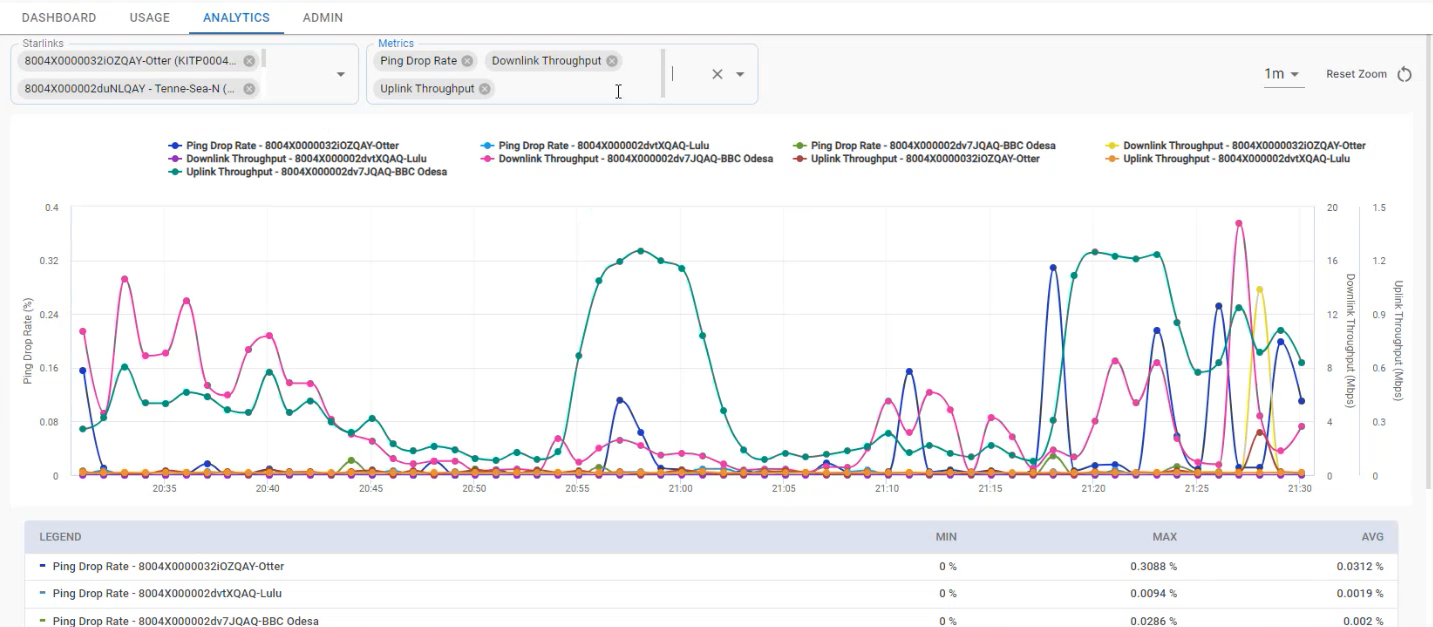
Multiple Metrics
The Legend provided below the Chart helps the user to differentiate between the various types of metric values plotted in the chart. It also shows the Minimum value, Maximum value, and Average value of the selected metric.
Use the dropdown menu at the top right corner of the chart to change the time interval between each time instance on the horizontal axis.
The charts have pinch and zoom functionality. Click anywhere on the chart and drag the cursor to select a specific area.
Release the cursor. The selected area will be zoomed in.
Click Reset Zoom button to reset the zoom and return to full chart.