
Activity
Click the Activity tab in the Reports screen.
The Activity tab enables the user to view reports about the data consumed by the users and their organization. Users can view the amount of data consumed between any particular time interval and view further breakdown of the data usage.
Users can view information such as:
Amount of data consumed by the Organization
Amount of data consumed by the sites
Amount of data consumed by the users
Amount of data consumed by each application
Number of hits obtained on blocked applications
The Risk Score of the users and sites
The information obtained from such reports can be used for further analysis and to make informed business decisions.
The Activity tab shows the usage data as shown in the below figure.
-20240515-144645.png?inst-v=9fcc34d5-360e-4e5f-a2f3-b66bb6c2a5f7)
Activity Tab
It shows detailed reports of the data used by the organization in various methods such as pie charts, line charts and tables.
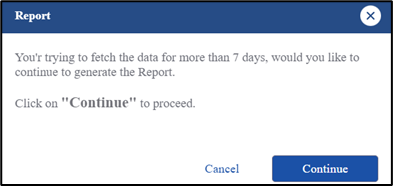
If the user selects a date range of more than 7 days, they will be asked to Generate Reports and view the data. Using Generated Reports, user can view detailed reports of data consumption in CSV & xlsx formats. Refer to section Generate Report for more information.
Note: Please note that if the user has selected only one site in the dropdown menu at the top of the screen, they can view the activity reports beyond 7 days without generating the report. Once the user selects more than one site, they have to generate reports to view activity reports for more than 7 days.
Generate Reports Dialog Box
All the blue highlighted text in the Activity screen is clickable. It can be the name of a site, name of a user, name of an application or application category. Clicking it filters the entire screen and displays the data usage information corresponding only to that site, user, application, or application category.
Overview
The Overview section shows headers with the following information:
-20240515-145112.png?inst-v=9fcc34d5-360e-4e5f-a2f3-b66bb6c2a5f7)
Overview
Total – The total amount of data consumed by the selected organization or sub-organization in GB. The upload data and download data are displayed individually. Green Up arrow denotes the upload data and Red Down arrow denotes the download data.
Top Site – The site that has used the maximum amount of data.
Top User – The Username or IP Address or MAC Address of the user that has used the maximum amount of data.
Top App – The application that has consumed the maximum amount of data.
Top Blocked – The blocked application that has garnered the maximum number of hits. The number of hits is displayed below the name of the application.
Top Risk Score - The site that has received the maximum risk score. The Risk Score and its category is displayed below the name of the site.
Usage - Pie Charts
The Usage section shows four pie charts that breakdown the data usage information into Top Categories, Top Applications, Top Applications Blocked and Top Risk Score.
By default, the top ten items will be shown in the pie chart.
Click the dropdown given next to the Usage heading to change the number of items. The user can choose between 10/20/30/50 from the dropdown menu.
-20240515-145550.png?inst-v=9fcc34d5-360e-4e5f-a2f3-b66bb6c2a5f7)
Usage
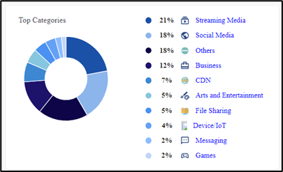
Top Categories
The Top Categories pie chart groups the applications used by the users into categories and shows the percentage of data used by each category. These categories cover different genres such as Streaming Media, Social Media, Business, Arts & Entertainment Games etc. Hovering on any item on the pie chart highlights the category and shows the amount data consumed by that category in GB.
Top Categories
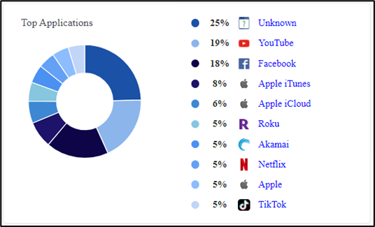
Top Applications
The Top Applications pie chart shows the percentage of data consumed by the different applications. Hovering on any item on the pie chart highlights the application and shows the amount data consumed by that application in GB.
Top Applications
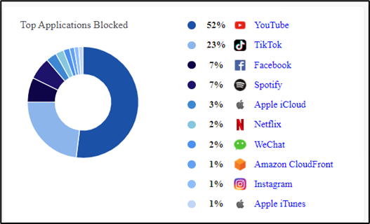
Top Applications Blocked
The Top Applications Blocked pie chart shows the percentage of hits garnered by the different blocked applications. Hovering on any item on the pie chart highlights the application and shows the number of hits gained by that application.
Top Applications Blocked
Top Risk Score
The Top Risk Score pie chart shows the different percentages of risk obtained by the sites of the selected organization. Hovering on any item on the pie chart highlights the site and shows the risk score and risk types of the particular site.
-20240517-120405.png?inst-v=9fcc34d5-360e-4e5f-a2f3-b66bb6c2a5f7)
Top Risk Score
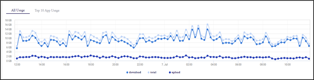
All Usage
All Usage section shows a line chart that displays the amount of data used by the organization at different time instances. The horizontal axis contains the time instances, and the vertical axis contains the amount of data in GB. The graph between these two axes gives the user a clear understanding of how the data has been consumed over the selected time period.
All Usage
The chart contains three different lines that denote the Upload data, Download data and Total data.
Click Download button at the bottom of the chart to show only the download data line.
Click Upload button at the bottom of the chart to show only the upload data line.
Click Total button at the bottom of the chart to show only the total data line.
Hover the cursor at any point on the chart to view the amount of data used at that time instance.
The time interval for each value on the chart varies with the time interval taken for generating the report.
If the report is generated for within a day, the time interval for each value is 15 minutes.
If the report is generated for day to 3 days, the time interval for each value is 1 hour.
If the report is generated for more than 3 days, the time interval for each value is 12 hours.
Click the dropdown menu at the top right corner of the chart to change the time interval between entries.
Top 10 App Usage
Top 10 App Usage section shows a line chart that displays the amount of data used by the top applications at different time instances. The horizontal axis contains the time instances, and the vertical axis contains the amount of data in GB. The graph between these two axes gives the user a clear understanding of how the data has been consumed over the given time period.

Top 10 App Usage
The chart contains different lines that denote each application.
Click the application name given at the bottom of the chart to show the line chart of that application only.
Hover the cursor at any point on the chart to view the amount of data used at that time instance.
By default, the details of the top 10 applications will be shown in the line chart.
Click the dropdown given at the top right corner of the chart to change the number of applications. The user can choose between 5/10/20/30/50/All from the dropdown menu.
Click the dropdown menu at the top right corner of the chart to change the time interval between entries.
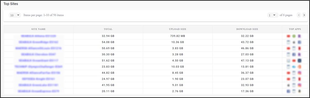
Top Sites
The Top Sites section shows a table that lists all the sites under the organization and their data consumption. The Table shows the following information:
Site Name – Name of the Site.
Total – Total amount of data consumed by the site.
Upload Size – Amount of Upload data.
Download Size – Amount of Download data.
Top Apps – The top 3 applications that consumed the maximum amount of data in that site.
Click the Download button to download the Top Sites data locally in CSV format.
Click the dropdown given below the Top Sites heading to change the number of sites displayed in one page. The user can choose between 5/10/15/20/25/50/100 from the dropdown menu.
The pagination helps the user navigate to the next page by using the < > buttons or click the dropdown menu to move to the intended page.
Top Sites
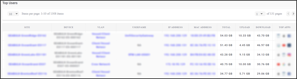
Top Users
The Top Users section shows a table that lists all the users under the organization and their data consumption. The Table shows the following information:
Device Alias - Alias name of the device.
IP Address
MAC Address
Site – Name of the Site.
Device – Name of the device connected to the user.
VLAN – Type of VLAN.
Total – Total amount of data consumed by the user.
Upload – Amount of Upload data.
Download – Amount of Download data.
Top Apps – The top 3 applications that consumed the maximum amount of data for the user.
Top Risk - The Risk Score of the user. Click the risk score the view the risk types.
Click the Download button to download the Top Users data locally in CSV format.
Click the dropdown given below the Top Users heading to change the number of users displayed in one page. The user can choose between 5/10/15/20/25/50/100 from the dropdown menu.
The pagination helps the user navigate to the next page by using the < > buttons or click the dropdown menu and select the intended page.
Top Users
Top Application
The Top Application section shows three tables namely, Top Downloads, Top Uploads and Top Blocked Applications.
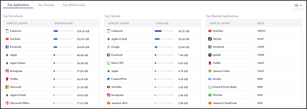
Top Application
The Top Downloads table lists the applications that have consumed the maximum amount of Download data. It shows the name of the application and the amount of Download data.
The Top Uploads table lists the applications that have consumed the maximum amount of Upload data. It shows the name of the application and the amount of Upload data.
The Top Blocked Applications table lists the blocked applications that have garnered the maximum number of hits. It shows the name of the application and the number of hits.
Click the dropdown given at the top right corner of the table to change the number of applications. The user can choose between 10/20/30/50 from the dropdown menu.
Top Domain
The Top Domain section shows three tables namely, Top Downloads, Top Uploads and Top Blocked.
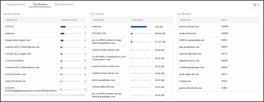
Top Domain
The Top Downloads table lists the domains that have consumed the maximum amount of Download data. It shows the name of the domain and the amount of Download data.
The Top Uploads table lists the domains that have consumed the maximum amount of Upload data. It shows the name of the domain and the amount of Upload data.
The Top Blocked table lists the blocked domains that have garnered the maximum number of hits. It shows the name of the domain and the number of hits.
Click the dropdown given at the top right corner of the table to change the number of domains. The user can choose between 10/20/30/50 from the dropdown menu.
Top IP (Network)
The Top IP(Network) section shows three tables namely, Top Downloads, Top Uploads and Top Blocked.
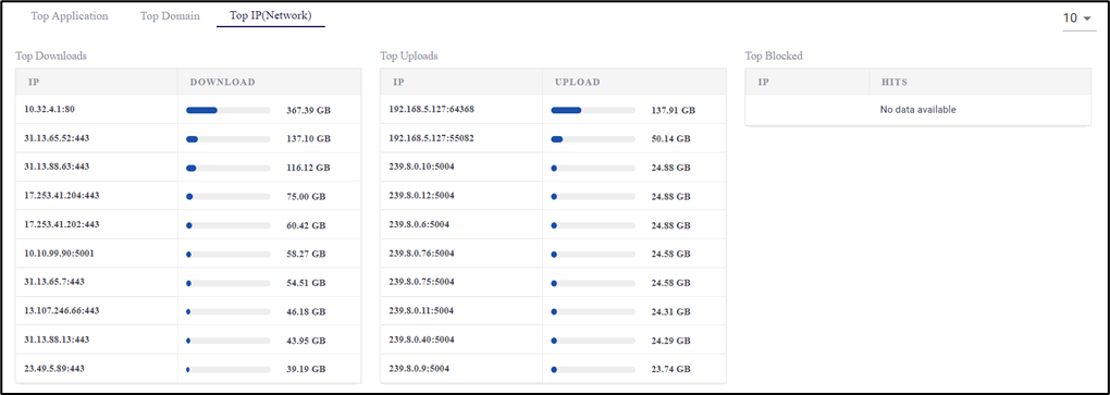
Top IP (Network)
The Top Downloads table lists the IPs that have consumed the maximum amount of Download data. It shows the IP Address and the amount of Download data.
The Top Uploads table lists the IPs that have consumed the maximum amount of Upload data. It shows the IP Address and the amount of Upload data.
The Top Blocked table lists the blocked IPs that have garnered the maximum number of hits. It shows the IP Address and the number of hits.
Click the dropdown given at the top right corner of the table to change the number of applications. The user can choose between 10/20/30/50 from the dropdown menu.
Filter
The Filter button can be used to filter the Activity reports screen based on the MAC/IP Address or Application Category.
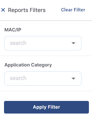
Report Filters
Select the MAC/IP from the dropdown menu.
Or Select the Application Category from the dropdown menu.
Click Apply Filter button to filter the Reports screen and show the data usage corresponding only to the selected users or application categories.
Generate Report
Click the Generate Report button to generate the Reports.
-20250821-124122.png?inst-v=9fcc34d5-360e-4e5f-a2f3-b66bb6c2a5f7)
Generate Report
Also, if the user selects a date range of more than 7 days to view activity reports, they will be asked to Generate Reports and view the data.
Select the Start Date and Start Time using the date picker and the clock.
Select the End Date and End Time using the date picker and the clock.
Select the Organization from the dropdown menu.
Select the Site from the dropdown menu.
Select the MAC/IP from the dropdown menu. This field is optional.
Select the Application Category from the dropdown menu. This field is optional.
Select the Application from the dropdown menu. This field is optional.
Select the VLAN from the dropdown menu. This field is optional.
Select the WAN Type from the dropdown menu. This field is optional.
Select the Format from the dropdown menu. The options available are xlsx/csv.
To download the Detailed Flow Report, select the Detailed Flow Report checkbox.
Click Generate button to start generating the report.
Click the Generated Reports tab from the Reports page to view the status of the generated report.
-20250821-124548.png?inst-v=9fcc34d5-360e-4e5f-a2f3-b66bb6c2a5f7)
Generated Reports Tab
The Generated Reports tab shows a table that lists all the reports generated from the Activity Reports screen. It shows information such as Requested At date and time, Generated At date and time, Metadata, Status, Report Type, Summary and Flow Report.
Click the
 Delete icon under the Actions column to delete the report entry.
The status of the generated report would be shown as ‘INPROGRESS’ when the report is being generated.
Once the report generation process is complete, the status changes to ‘COMPLETED’ and the Download button under the Summary column gets enabled.
Click Download button under the Summary column to download the Report.
If the user had selected the Detailed Flow Report checkbox while generating the report, the Download button under the Flow Report column will also be enabled.
Click Download button under the Flow Report column to download the Detailed Activity Report in CSV format.